


the typography and visual language of brick lane
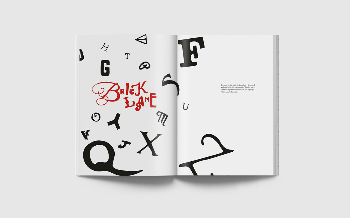
My first publication as a Visual Communication student. I analysed in-depth the typography in the area of Brick Lane in London and created by own A-Z of Brick Lane, thereby integrating it with the grid to create compositions. After photographing shop, restaurant and road signs, the A-Z was created from random pictures by manually tracing each alphabet and then image tracing it. This alphabet has a myriad of funky styles, echoing the eccentricity and bustle of vibrant Brick Lane. Looking back, this project did have a lot of flaws, but it was crucial nonetheless. It marked my foray into the world of editorial design and print and is a starting point against which I map my progress.


Please hit appreciate if you liked this endeavour. Cheers!


